The React Native Icon component provides a flexible way to integrate scalable vector icons into your mobile app. Easily customize size, color, and style for enhanced UI design. With support for popular icon libraries, this component helps create visually appealing, interactive elements, improving the overall user experience in React Native.
Icons Components
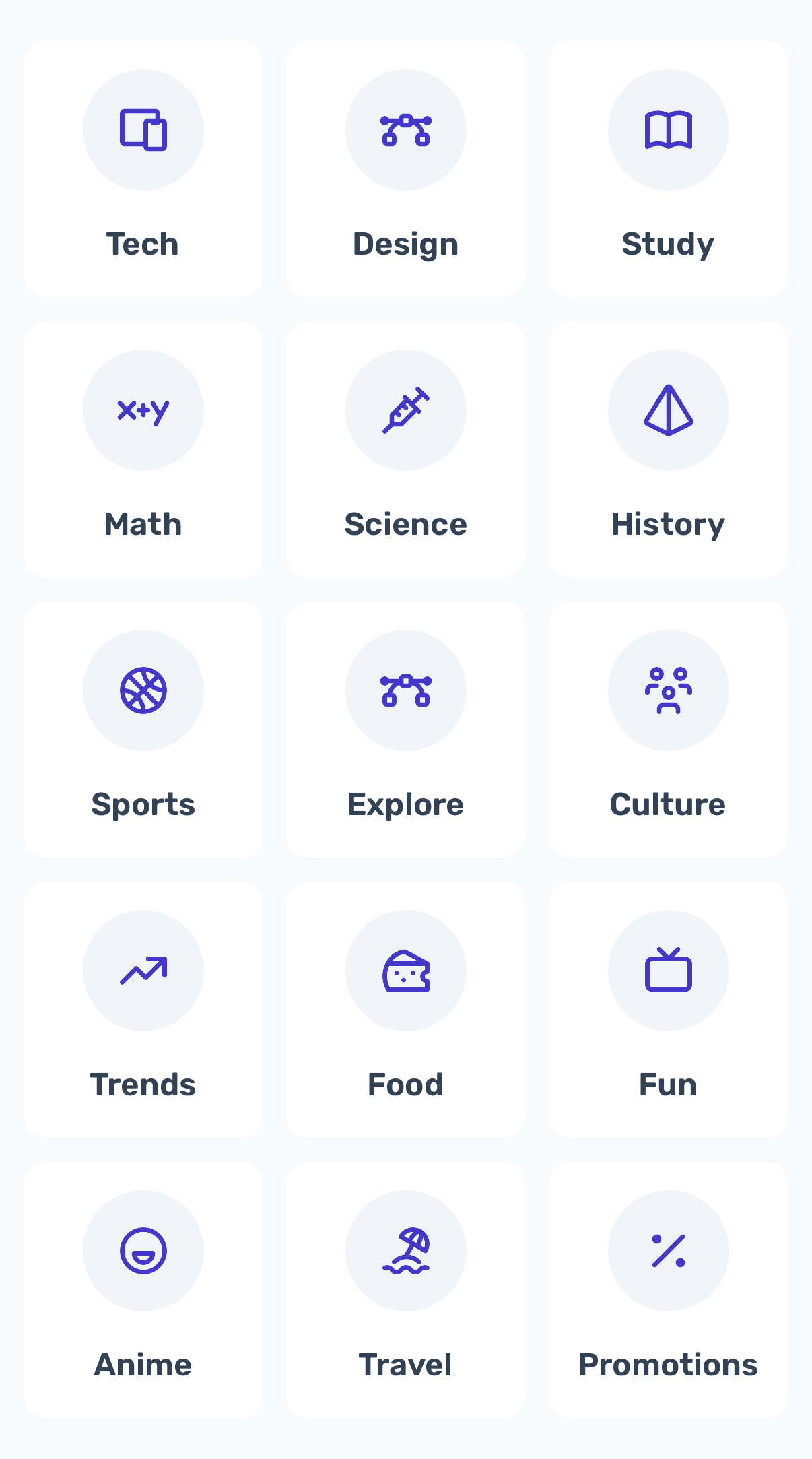
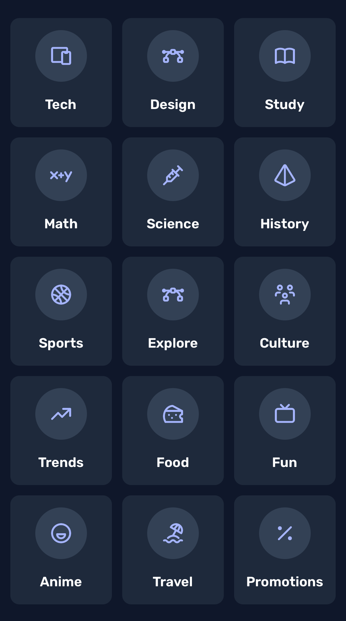
Tabler Icons Component
Collection of free and open sourced Tabler icons
Preview
Code
// @/components/common/IconItemCard.tsx

import { useColorScheme } from 'nativewind';
import colors from 'tailwindcss/colors';
import React from 'react';
import { Text, TouchableOpacity, View } from 'react-native';

type ColorVariant =
  | 'red'
  | 'orange'
  | 'amber'
  | 'yellow'
  | 'lime'
  | 'green'
  | 'emerald'
  | 'teal'
  | 'cyan'
  | 'sky'
  | 'blue'
  | 'indigo'
  | 'violet'
  | 'purple'
  | 'fuchsia'
  | 'pink'
  | 'rose'
  | 'slate'
  | 'gray'
  | 'zinc'
  | 'neutral'
  | 'slate';


type IconItemCardProps = {
    item: {
      id: number;
      name: string;
      icon: React.ReactElement;
    };
    variant?: ColorVariant;
  };

  export const IconItemCard = ({ item, variant = 'blue' }: IconItemCardProps) => {
    const { colorScheme } = useColorScheme();
    const isDark = colorScheme === 'dark';
    const iconColor = isDark ? colors[variant][300] : colors[variant][700];

    const iconWithColor = React.cloneElement(item.icon, { color: iconColor });

    return (
      <TouchableOpacity className={'flex-1 items-center gap-4 bg-white dark:bg-slate-800 rounded-xl p-4'}>
        <View
          className={
            'justify-center items-center h-[60px] w-[60px] rounded-full bg-slate-100 dark:bg-slate-700 p-2'
          }>
          {iconWithColor}
        </View>

        <Text className={'text-lg font-semibold text-slate-700 dark:text-white'}>{item.name}</Text>
      </TouchableOpacity>
    );
  };
Usage
import { IconItemCard } from '@/components/common/IconItemCard';
import {
  IconBallBasketball,
  IconBeach,
  IconBook,
  IconBrandFunimation,
  IconCheese,
  IconDevices,
  IconDeviceTv,
  IconMathXPlusY,
  IconPercentage,
  IconPyramid,
  IconTrendingUp,
  IconUsersGroup,
  IconVaccine,
  IconVectorBezier,
} from '@tabler/icons-react-native';
import React, { useCallback } from 'react';
import { View, FlatList, RefreshControl } from 'react-native';

type ColorVariant =
  | 'red'
  | 'orange'
  | 'amber'
  | 'yellow'
  | 'lime'
  | 'green'
  | 'emerald'
  | 'teal'
  | 'cyan'
  | 'sky'
  | 'blue'
  | 'indigo'
  | 'violet'
  | 'purple'
  | 'fuchsia'
  | 'pink'
  | 'rose'
  | 'slate'
  | 'gray'
  | 'zinc'
  | 'neutral'
  | 'slate';

export const Icons = () => {
  return [
    {
      id: 1,
      name: 'Tech',
      icon: <IconDevices width={28} height={28} />,
    },
    {
      id: 2,
      name: 'Design',
      icon: <IconVectorBezier width={28} height={28} />,
    },
    {
      id: 3,
      name: 'Study',
      icon: <IconBook width={28} height={28} />,
    },
    {
      id: 4,
      name: 'Math',
      icon: <IconMathXPlusY width={28} height={28} />,
    },
    {
      id: 5,
      name: 'Science',
      icon: <IconVaccine width={28} height={28} />,
    },
    {
      id: 6,
      name: 'History',
      icon: <IconPyramid width={28} height={28} />,
    },
    {
      id: 7,
      name: 'Sports',
      icon: <IconBallBasketball width={28} height={28} />,
    },
    {
      id: 8,
      name: 'Explore',
      icon: <IconVectorBezier width={28} height={28} />,
    },
    {
      id: 9,
      name: 'Culture',
      icon: <IconUsersGroup width={28} height={28} />,
    },
    {
      id: 10,
      name: 'Trends',
      icon: <IconTrendingUp width={28} height={28} />,
    },
    {
      id: 11,
      name: 'Food',
      icon: <IconCheese width={28} height={28} />,
    },
    {
      id: 12,
      name: 'Fun',
      icon: <IconDeviceTv width={28} height={28} />,
    },
    {
      id: 13,
      name: 'Anime',
      icon: <IconBrandFunimation width={28} height={28} />,
    },
    {
      id: 14,
      name: 'Travel',
      icon: <IconBeach width={28} height={28} />,
    },
    {
      id: 15,
      name: 'Promotions',
      icon: <IconPercentage width={28} height={28} />,
    },
  ];
};

export default function Screen() {
  const [data, setData] = React.useState(Icons());
  const [currentVariant, setCurrentVariant] = React.useState<ColorVariant>('indigo');
  const [refreshing, setRefreshing] = React.useState(false);

  const colorVariants: ColorVariant[] = [
    'red', 'orange', 'amber', 'yellow', 'lime', 'green', 'emerald', 'teal',
    'cyan', 'sky', 'blue', 'indigo', 'violet', 'purple', 'fuchsia', 'pink',
    'rose', 'slate', 'gray', 'zinc', 'neutral'
  ];

  const shuffleArray = (array: any[]) => {
    const newArray = [...array];
    for (let i = newArray.length - 1; i > 0; i--) {
      const j = Math.floor(Math.random() * (i + 1));
      [newArray[i], newArray[j]] = [newArray[j], newArray[i]];
    }
    return newArray;
  };

  const getRandomColorVariant = () => {
    const randomIndex = Math.floor(Math.random() * colorVariants.length);
    return colorVariants[randomIndex];
  };

  const onRefresh = useCallback(() => {
    setRefreshing(true);
    const newVariant = getRandomColorVariant();
    setCurrentVariant(newVariant);
    setData(shuffleArray(Icons()));

    setTimeout(() => {
      setRefreshing(false);
    }, 1000);
  }, []);

  return (
    <View className={'flex-1'}>
      <FlatList
        data={data}
        columnWrapperStyle={{
          gap: 12,
          paddingHorizontal: 12,
        }}
        contentContainerStyle={{ gap: 12, paddingVertical: 24 }}
        showsVerticalScrollIndicator={false}
        numColumns={3}
        className={'bg-slate-50 dark:bg-slate-900'}
        renderItem={({ item }) => <IconItemCard item={item} variant={currentVariant} key={item.id} />}
        keyExtractor={(item) => item.id.toString()}
        ListHeaderComponentStyle={{ marginBottom: 24 }}
        refreshControl={<RefreshControl refreshing={refreshing} onRefresh={onRefresh} />}
      />
    </View>
  );
}